Does a label influence your purchase decisions?
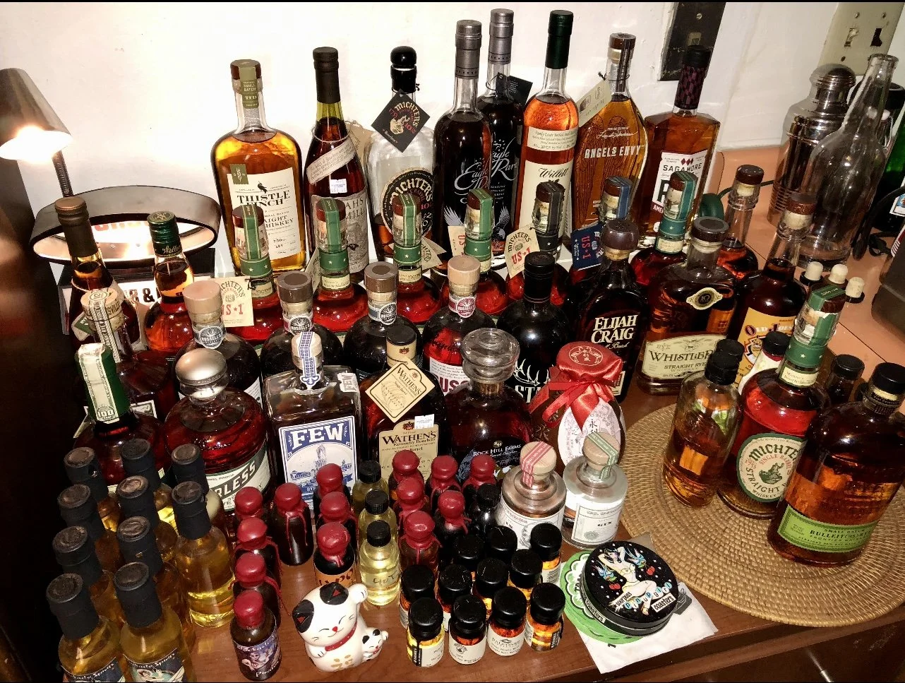
While I would like to say that I am completely immune to the seductive nature of advertising, I would be lying to you if I boldly claimed that I was strong enough to resist making a purchase based on a label or bottle style. I am well aware that we have all been been indoctrinated since birth to be the perfect consumers, but with the absurd amount of floor bourbon in my place, I have been forced to come to grips with my acquisition problem once and for all. You see, I grew up collecting baseball cards, which morphed into G.I. Joe collecting, which morphed into Star Wars action figures, then action figures in general. My floor toys had my house overrun, and with little room to walk, I had to once and for all seek help and dissolve my collection. After taking a few years selling through my vast collection(s), I thought I had the collecting bug at long last licked. As my whiskey journey turned into my whiskey obsession, here we are all over again.
It started rather innocently enough…….
Over the last year, I’ve fought hard to not buy new things simply because they are new and have a cool label design, and focused on bottle killing a lot of things. If there was ever a crimes against whiskey bottles tribunal in the Hague, I calculate that I would be convicted easily. I spent an entire month or so wiping out low-fill opens, vowing to not buy anything until making space on the bar, and I made some very good progress. I was doing it, I was taking control once more, and I was whittling away at my stupid amount of bottles. No longer was I going to feel embarrassed when people asked me how many bottles I had in my collection, I was making progress and I felt great about that. With my newfound determination to stop accumulating and curating a “collection,” and with my defenses up, it was safe to ask, “am I more immune to labeling? More discerning?” Proudly, I thought so, until I saw the label below….
I grew up at a time where 1950’s and 1960’s futurism was still very prevalent on television. The Twilight Zone, Jetson’s, Lost in Space, and Star Trek, were all syndicated, and the Saturday afternoon and late night tv movies were classics like Earth vs. The Flying Saucers, and The Day the Earth Stood Still. I loved those things so much as they showcased a silly, fantastic and sometimes bright future. The imagery had a huge impact on me and it was everywhere and there it all is right on a whiskey label! Part Rocket to the Moon, a dash or two of Buck Rogers and Flash Gordon, boat loads of robots, a heroine with a ray-gun (and a cocktail mixer!), citywide destruction, I mean this label is EVERYTHING to me. How can I possibly resist? I’m here to tell you folks, I can’t. I will own this. I’m defeated. All my bravado of cleaning space and being strong? Gone. Removed. Wiped away by a futuristic robot vacuum.
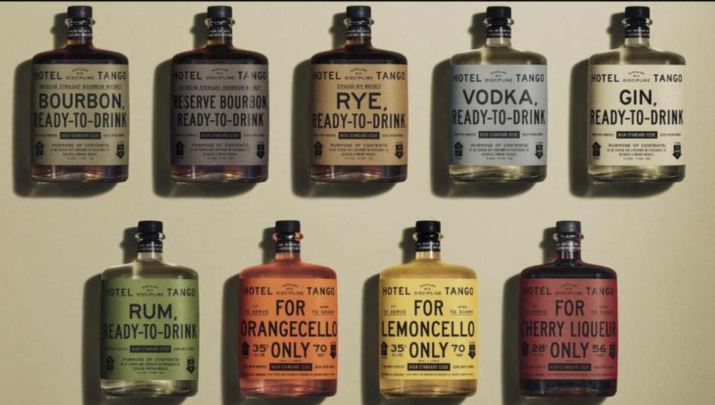
There have been so many great label releases in the last year, hell just go look at Coming Whiskey on Instagram and you’ll get your relentless advertising fix all in one spot. Can you the reader resist making the purchase based on label alone? What if you’re a first responder? A horse racing fan? A baseball insaniac? Former or current military? If you aren’t do you know someone that is? GIFT IDEA! There is literally a label for everyone on earth. I think if we the consumers could resist, there would be less of them out there but since we can’t, we are continually confronted with new and interesting bottle and label designs that are engineered to capture our attention (and our hard earned scratch).
Game of Thrones had a Scotch label, so why not Peaky Farging Blinders too?
Guest columnist Brett Bauer has frequently opined that a brand can get you to buy a bottle with a great look, or fancy marketing, but the challenge is getting you to buy a replacement, or graduate into the next offering from the brand lineup. This aligns with my feelings on the matter. A beautiful label or bottle design can stand out on the shelf at a store, or beckon to you in a dimly lit bar, begging for a purchase (I mean, that’s kind of the entire idea right?) but if the whiskey inside of it isn’t good, then what? You’re stuck with an art piece that reminds you to never buy from them again right? The brand then becoming victim to a self-inflicted wound.
This one appeals to those familiar with the military experience. Christmas is saved! You’ll get four of each of them. Probably.
Over the years I’ve had some brands that were absolutely ruined by great label and bottle looks, with some really not ready for primetime whiskey (I’m trying to be nice, obviously I’ve had my morning coffee and there are no holes in my socks). These BIG HAT-NO CATTLE bottles have come mostly from the micro-distillery world, mostly Few out of Illinois, or Virgil Kaine (with their infuriatingly glib age statement they used to have) who’s beautiful looks enticed me to make that one purchase. I’ve never gone back to buy seconds, even though I’m sure that their continued existence means that what’s inside has improved greatly. I suppose what I am saying is, a beautiful label must match what is inside, if the wrapping is better than the present, then screw that brand I hope they step on a Lego, barefoot.
You might not buy this for a whiskey fan, but you know it would be a Christmas Day hit for the baseball fan in your life, who also will never, ever open it. Also, fuck the Dodgers. A reminder to never miss an opportunity to take a shot at the boys in blue and white.
With an absurd variety of choices on shelves today, what are some of the the labels that you’ve been a sucker for simply because of what’s printed or engraved on the bottle? Let us know in the comments below. As always, thank you for taking the time to read, I hope you’ve enjoyed your visit.
- Mickey Pinstripe


